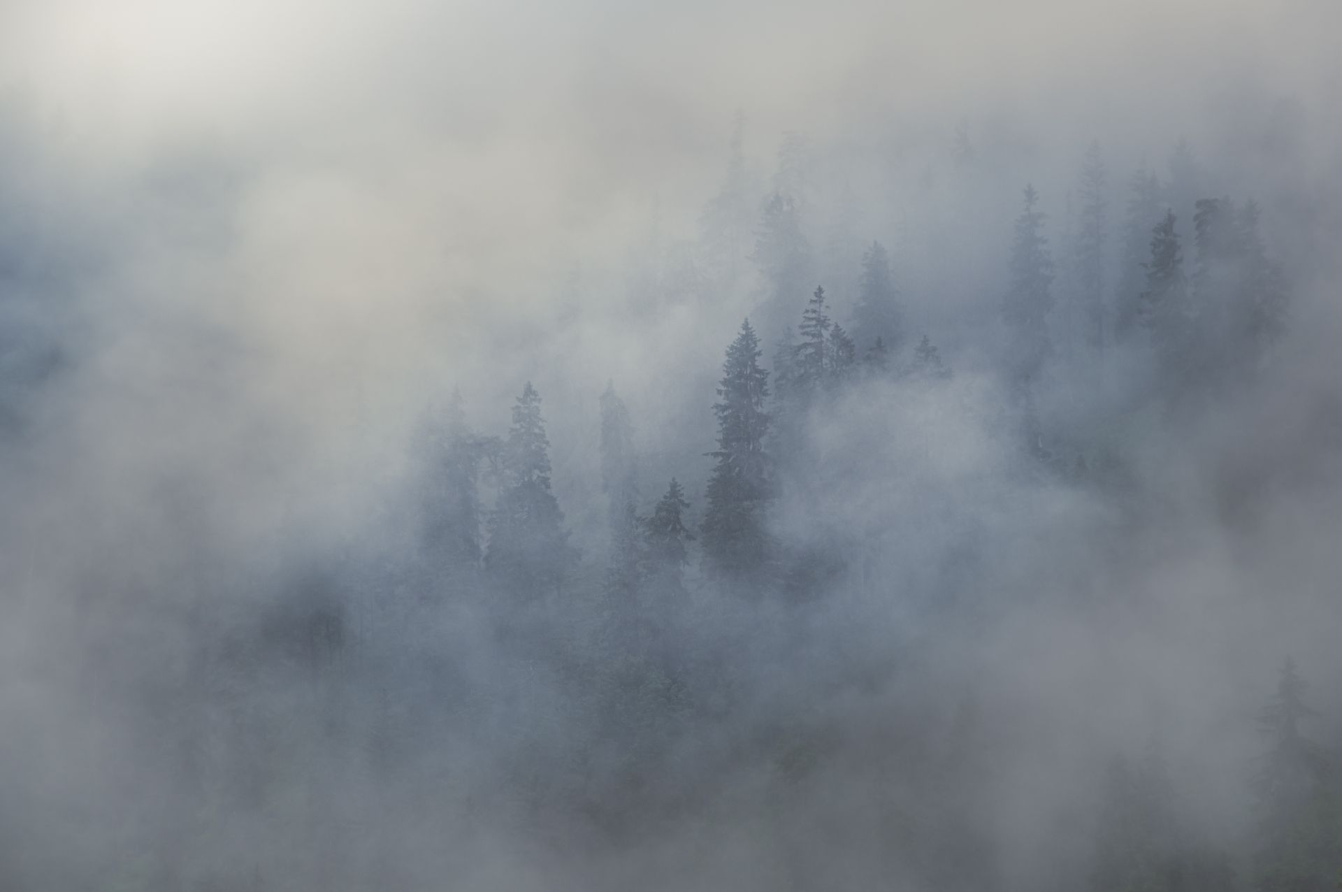
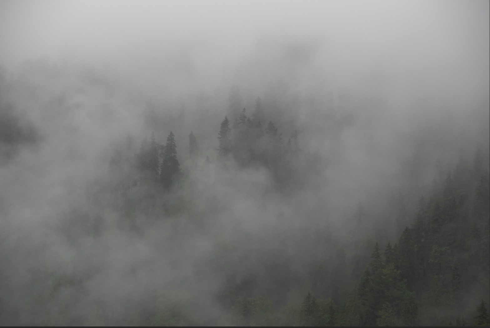
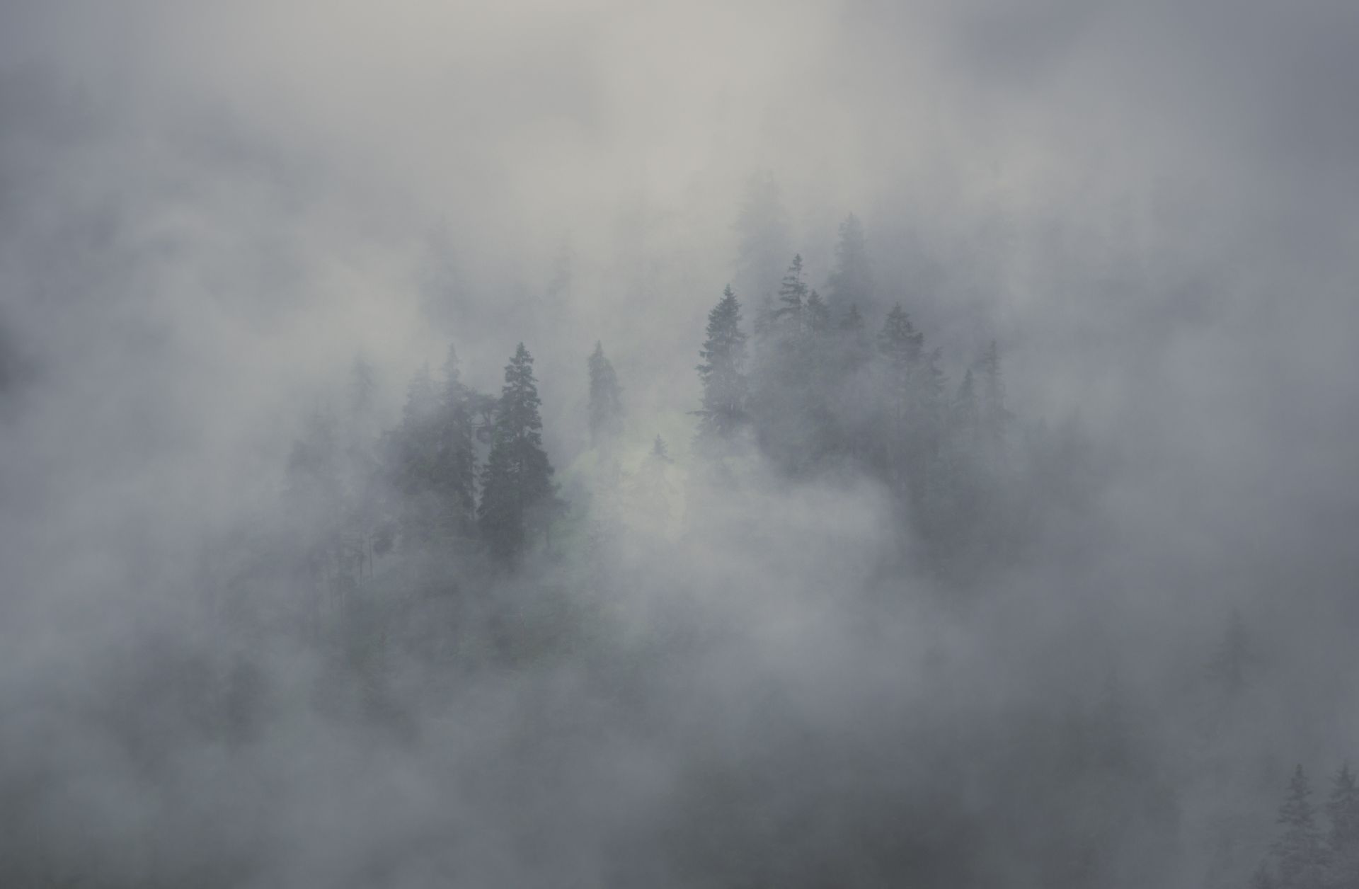
Recently we had some really long and heavy rain in the area (fortunately not as catastrophic as in other regions!). I usually don’t go out a lot during rain – neither for hiking nor for photography. For the hiking part: if any of the clothes is not fully waterproof, it’s not real fun. Also, the ground is getting soaked, dirty and slippery that I just usually prefer to stay dry and clean inside. For the photography part: neither my camera nor my lenses are waterproof. I have a rain gear for the camera + lens but it’s just always cumbersome to handle it in the rain.
The day I took these shots, we experienced a rain-pause and I just wanted to get out. We drove to one of my favourite spots to check whether I could get some moody / rainy photos. After getting there I realized that I wouldn’t get the shot I had in mind. While walking back to the car I saw all the clouds rising from the mountain forest. I watched the scene for a while to find a proper motive and waited for the right moment when the clouds had the right mix of thin and thick so that only some trees were visible. This can be tricky because it is hard to predict how the clouds develop and how long you will have to wait. But I think it was worth waiting. As the clouds are moving comparatively quickly you should have the camera settings done when the situation is fine. A tripod can come handy in such a case.
Coming to the processing – even though the list below might not look too short, I didn’t really do a lot:
- globally:
- crop
- slightly increase sharpness
- used split toning to cool down the mid tones a bit into the blue and made the lights a little warmer
- added a vignette in the corners. Depending on the content of the corner(s), I just
- darkened or lightened the area or
- reduced the “remove haze to ‘add’ more fog or
- reduced clarity to add more of the ethereal look when there were too few clouds in the area of the corner or
- reduced saturation
- added a single radial filter in the center, to
- increase brightness
- lowered the depths and adjusted the black point
- increased the structure value and
- decreased clarity
And that’s it! Don’t get lured into raising the saturation or dynamic and try to find the sweet spot of sharpness and dynamic values.


Saturation can be my downfall sometimes! That and clarity. Instinct tells me that more color and clarity equals a more stunning photo. But often, less is more. You did a splendid job with these.
I totally know what you mean! For me it’s always a complex decision: On SocialMedia the highly saturated photos are told to work better. A lower saturation and less clarity can lead to a ways moodier shot. But thanks a million for your Feedback!
Yes, the important lessons we must learn as we go along. Enjoying the journey together.