We planned this hike as usual as a nice hiking trip. Real photographers would probably get up a couple of hours earlier, ascend in the dark to be at a nice spot for sunrise. Even though I adore those sunrise photos I am honest to myself: After a 5-day working week with some challenging projects, I just don’t want to sacrifice some recovery. I know it is questionable to be exhausted from work – sounds like a misaligned work-life balance. But I’m working on that. – But even without that reason. I would like to know the exact spots that are worth the effort.
Long story short: we started a nice hike on a yet unknown track. The path on the map looked promising, the weather was forecast to be sunny, slightly hazy, not too warm, … ideal hiking conditions! The first part of the track was along a forest road – nothing really special. Just a year ago I would have left the camera in the backpack. In the meantime, I always have my camera mounted directly on the shoulder strip. Simply to lower the barrier of just taking a shot whenever I see a motive.
The Hut
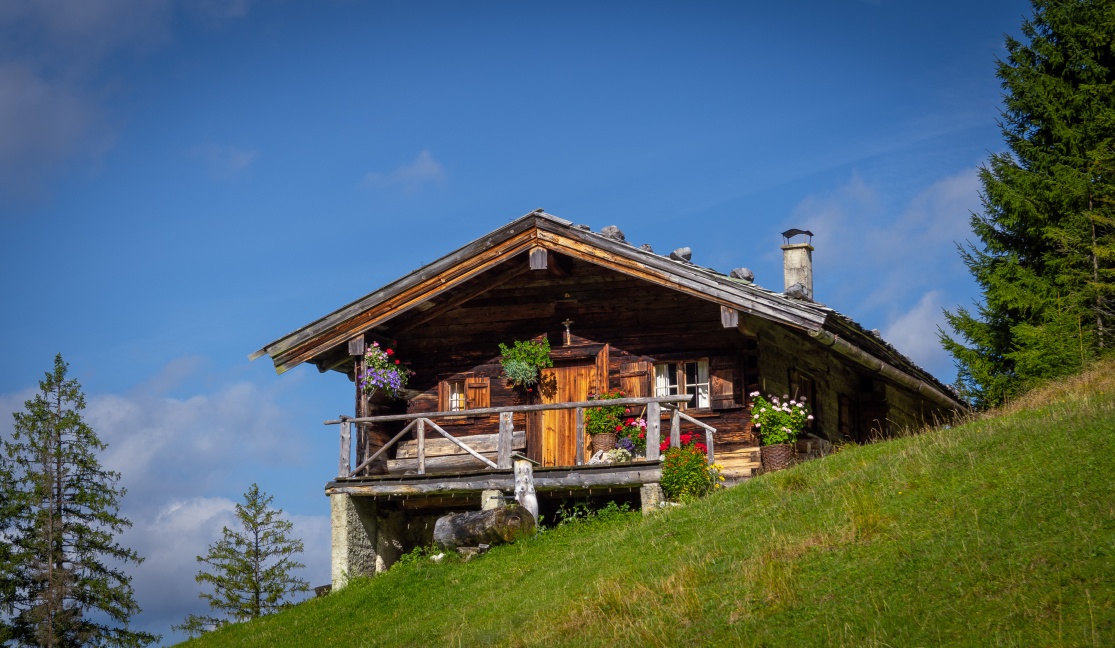
One of the first really nice motives was this nice little hut. Those huts were used in former times by the people who herded the cattle on the alpine meadows. The moment was especially great as we just came around a curve on a broader forest street and we totally did not expect a view like this. As you can see, the motive itself was almost done. The postprocessing itself wasn’t very strong, just adding some contrast, removing the trail of a plane in the top right and cleaning out some gras in the bottom.
The Border Stone
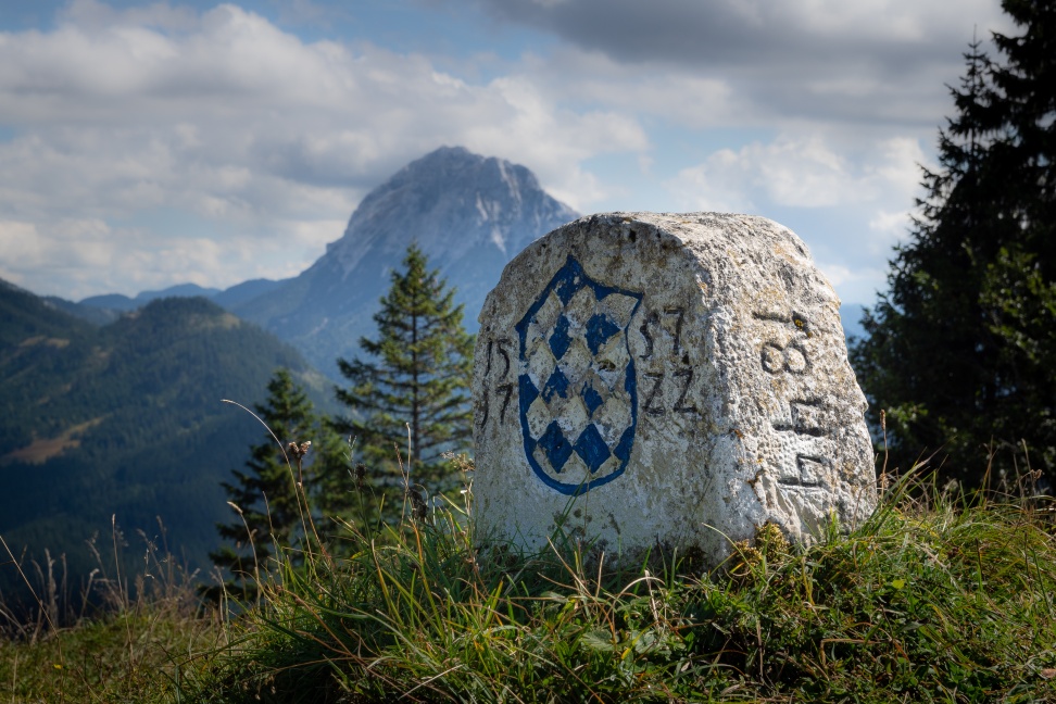
Later on, we discovered this border stone from the year 1557. Since then, it stands there and marks the border. From a photography perspective, it was interesting to find an interesting background which isn’t too confusing / distracting. As the motive itself is not very large, I was almost lying on the ground and crawling around to find a proper perspective. Finally, I realized the huge and impressive mountain in the far back. – Sure, the light wasn’t great and nice sidelight would be ways cooler. But that’s the tradeoff when going hiking.
Processing wise, I darkened the bright side of the stone and raised exposure of the shadow-side. I reduced clarity on the crass to remove some sharpness as it felt quite distracting otherwise. The background itself was just darkened a little. The sky needed some more contrast so that it didn’t look too flat and boring. Finally, I hope to come back to this point sometime in the future in another season and other time of the day.
A Framed Window
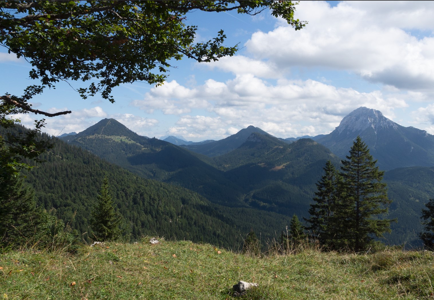
Somewhere later on I came across this little spot with a beautiful view. The spot drew my attention as it had the grass in the foreground, the bending in the top-left as a frame and the one in the right as a corner mark on the other side, the mountains in the midground and three more remarkable peaks in the background. – The personal connection is of course the view into all the mountains that we had hiked already in the past or planned already for the future!
Photography wise, I really tried to make a nice framing: The branch on the left should make up a nice frame. Low enough to embrace the photo but high enough to avoid an intersection with the horizon and mountains in the back. At the same time, the tree on the right should limit to the right but not disturb the mountain in the back too much. And finally: leave some grass in the foreground. Not too much, as there was nothing interesting in the meadow.
In the post processing, I tried to enhance the sky to make it more appealing. The foreground meadow required a lot of stamping to get rid of quite some clutter: leaves, stones, some grass, … In the midground there were just some patches in the forest (maybe parts of a forest road) that were stamped away.
The Descent
Our hike was not just up to a summit and then down again. It was more up, down, up again, down again, etc. In the end we had ways more elevation that we expected in the beginning. Right before one of the steeper descents I took this shot. In the front, my wife walking down into the mid left. The right-hand side is framed a bit by a dark large tree. The midground is close to being boring as it only shows a forest on a wide forest mountainside. Yet it’s not SO big that it starts being too boring. The midground connects to the background through the valley – and the background finishes again with the three peaks.
Post processing wise, I again stamped some patches in the forest in the midground. I simply preferred a consistent forest without the disturbing patches. The sky and background were darkened and received some contrast to make it just more dramatic. An overall vignette darkened the tree on the right a little too much. Therefore, the shadows in this tree were increased a bit to preserve some structure. The overall toning was changed to a warmer style to achieve a real autumnal look and feel.


I really need to focus on stamping out the distractions! This is an aspect that I have entirely ignored thus far, but I see that it makes a huge difference. Your explanations behind why you chose to do each piece of editing is helping me improve in my editing process as well.
Thank you for this worthful feedback! Stamping the tiny distractions has a very subtle effect. I also didn’t pay a lot attention to it in the past either. But it can make the photo look ways more cohesive. But sometimes you keep stamping and stamping and stamping 🙂
I definitely agree that stamping can make such a huge difference. I am paying more attention to this now. I like to leave some imperfections, but symmetry and cohesiveness is the goal. Oh the things I learn as I go.